No Proper Thief – User Interface Update
ZebraFox Games took inspiration from the popular Zombie High choose-your-own-adventure games, amoung others such as Necklace of Skulls, but mostly Zombie High when deciding to make a similar type reading game, however we wanted to improve it anyway we could, as well. Now, we are aware the stories of the Zombie High series cater to teens, as they follow a teen girl as she attends school and fights zombies, plus there is a lot of love interest going on in the angsty broth of the tales. I’ve written my fair share on love, but the relationships in my stories tend to be more dysfunctional, yet still more mature than teen romance, so i wanted to avoid that to some extent when writing No Proper Thief. I believe I’ve stayed true to my style with the story, but it’s more about staying a free man, than it is about love. There is still a love interest, but I tried my best not to make it seem forced.
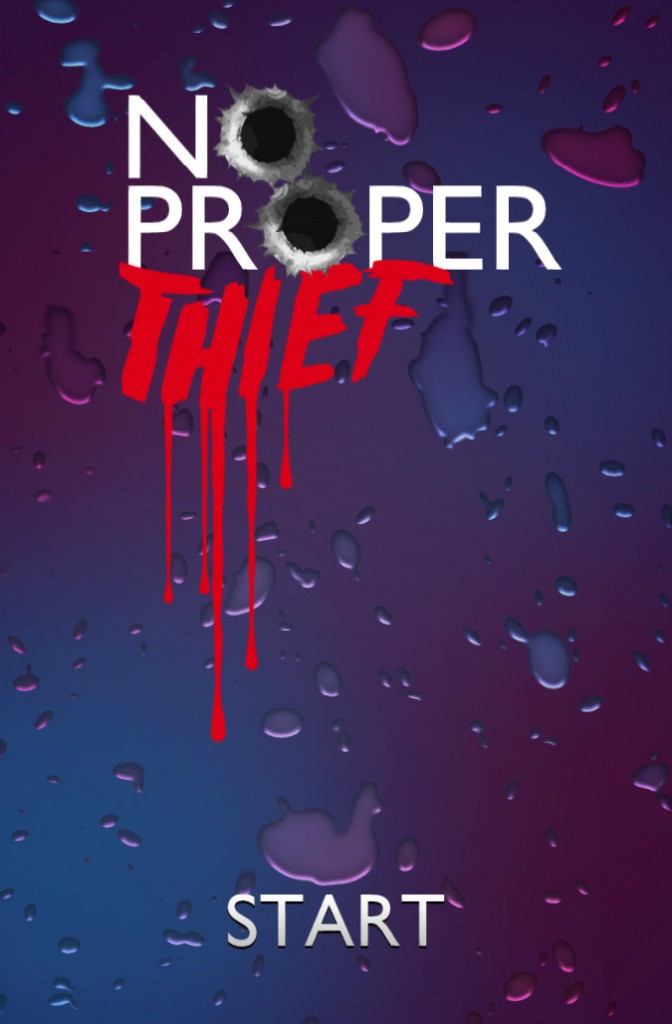
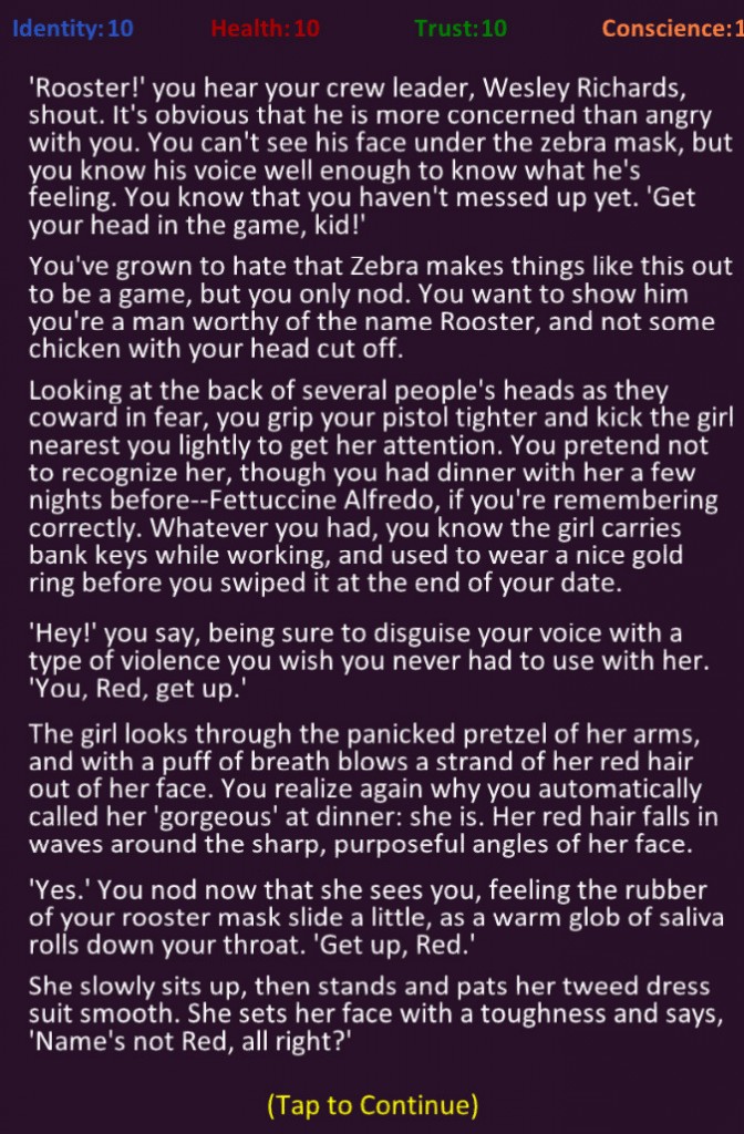
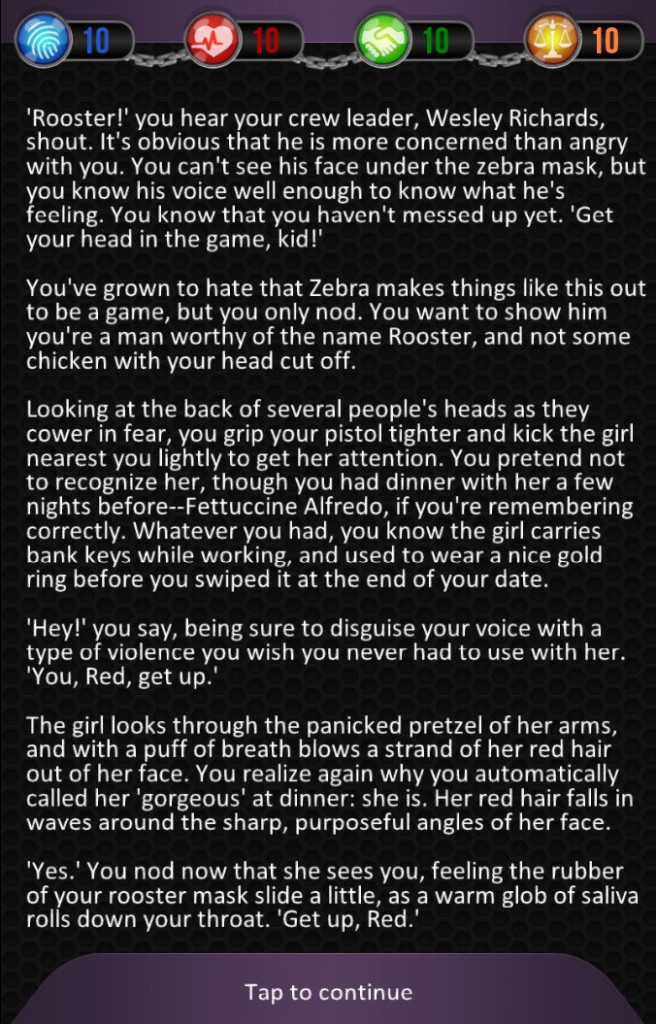
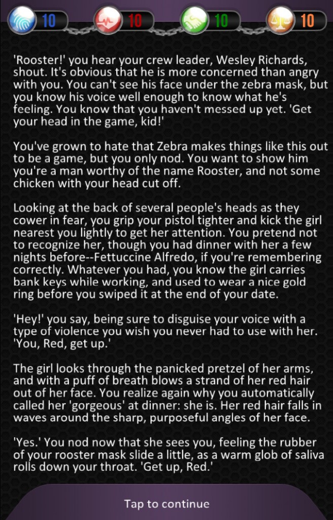
The main aspect i wanted to talk about in this post, however, is that of the user interface (UI). The title screen shown in the top left will likely stay that simple. It is animation, with music and sound effects added as well. We might decide to add a social media share button, an options button, and perhaps an achievement tab, but the simplicity appeals to use, and the game has not sound besides the title screen so as to not distract those reading. The other options can be added to the end screens that have yet to be fully developed. The top right image was the original user interface for No Proper Thief. it is similar to Zombie High in it’s simplicity, but with purple instead of black and colored stats. I was never happy which this, and after some pestering, I got David to re-imagine the UI with what i had in mind. The background is not textures, as you can see in the bottom two images. The states each have an icon that is hopefully easy to understand at a glance. if not, we plan to have each icon open a brief description window when clicked. David went above and beyond my expectations with the animation of the chains linking the stats, which represents hope if even only stat falls to zero–the weakness link–they all go down. The icons themselves are also animated and flash as if hit by a light every fifteen seconds or so. Overall, the new user interface is much cleaner, and far more professional.
User Interface
|
|
|
|
|
|


